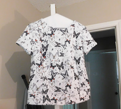
I took these photos early this AM. I had not finished applying my makeup and decided that you did not need to see that so cropped that out for this photo.
In looking at these photos, I don't think this fabric was the most flattering for making this top. 20/20 hindsight is most helpful after the fact. I think using a solid color fabric or coloring blocking is better for this top, that is what is depicted on the pattern sheet. The fullness of the top along with the lines of the fabric are not pleasing to me.
I decided that I should share the good, the bad and the ugly. I am going to use this as my learning moment to better review and audition the fabric more before cutting and sewing.
Subscribe to:
Post Comments (Atom)
August Sewing Simplicity 7295
I am not doing well as a blogger. I have been working on this project since July 30. Today, I finally finished it. It has been a stop-and-g...

-
I am not doing well as a blogger. I have been working on this project since July 30. Today, I finally finished it. It has been a stop-and-g...
-
Recent sewing projects I've completed have been challenging. It is the first time in probably months that I started a dress pattern a...


The fabric is lovely, I love the black grey white abstract print. And the top looks pretty to me, hopefully it grows on you over time.
ReplyDeleteI find it difficult to envisage how a fabric will turn out in a pattern. I've been agonising over which pattern to use for a big floral print for weeks, but then again, I'm indecisive about such things :)
I understand how you feel about which pattern for a particular fabric.
DeleteI would add a fairly bold necklace or coordinating scarf onto it which would break up the solid expanse of the blouse. My body is similar to yours. The fabric is lovely and your fit looks good.
ReplyDeleteThanks Kathy for this suggestion.
DeleteI love that top - the fabric is gorgeous. Perhaps changing it to a block colour on the top and leaving it with the lovely fabric on the bottom would work?
ReplyDeleteThat is a good idea and I would be able to salvage the rest of the fabric.
DeleteTry pairing the top with a pair of white pants or even a pair of jeans. I love the print.
ReplyDeleteThanks for suggestion.
DeleteYes, I love the print as well - but I guess if you are not happy with it, then you will not enjoy wearing it. Good luck with what you decide :)
ReplyDeleteI have not given up on this yet.
DeleteYou really should put a warning in your blogroll that "Sew Hot Mommi" is a pornographic website. Why would you have a link to such a site?
ReplyDeleteI have no idea what you are talking about. If you know me I would not have such a link, so not sure what this is about. It would be nice to know who you are so I could respond to you personally.
DeleteI really like this! Your print placement is a really great use of that large scale print.
ReplyDeleteThank you!
ReplyDeletegorgeous print! lovely
ReplyDelete